When you think of minimalism, what do you see? I see stark, white, clean lines, that verge on harsh. It’s always been a turn off for me; I’ve never identified with that aesthetic. I’ve been slowly reducing the amount of things I own, but I’ll admit, I’ve had a bit of anxiety over my inability to reconcile what makes a space comfortable to me and what I thought minimalism should look like. I have a tendency to let clutter build up if I own too much, so the solution is to own less. It simplifies life in a way that borders absurd. But, I still gravitate toward the glamorous, detailed, ornamented, and elaborate.
So, I put aside the aesthetic of the minimalist design movement, and thought of what minimalism really means: simplicity.
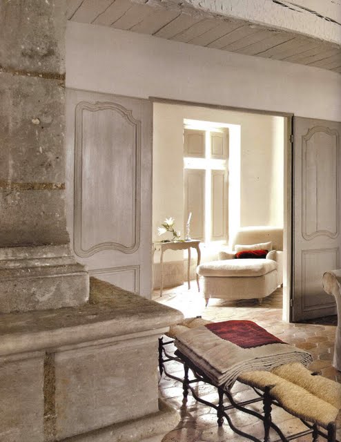
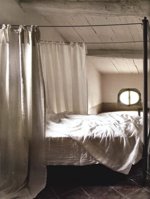
Now, take a look at the rooms below.
If you think about it, there are little to no frills in the rooms below. It’s all bare bones, but with beautiful lines. The palette is earthy and natural, which keeps it from looking as cold as many more modern minimal spaces do. It’s absolutely elegant and inviting, yet it still meets the standards laid out here.
I could live with this. I know most of my design-loving readers could, too.


So what’s the point? Why am I writing about this? Well, I think that to most people minimalism can be intimidating and exclusionary. It’s all or nothing, which doesn’t make it simple to work toward. The solution is to re-imagine it. Get rid of the assumptions, because it really doesn’t have to be that way. Everyone can benefit from simplicity, so if you’ve ever felt that you might want to live with less of anything in your life, you shouldn’t be intimidated. It’s personal. It’s not a competition. In fact it’s the opposite of that. Just start somewhere, and don’t be afraid that you aren’t doing it right.
Simple.
images from Coté Sud {via} Haute Design

i love minimalist rooms, but i also feel that sometime they feel a little too stark and bare. these are the perfect compromise, so clean and simple, but beautiful and warm at the same time! great finds! i love that bed. one of my childhood dreams is to have a canopy bed. someday…
Love me some minimalism. Also love that first picture. However, the second reminds me of a hospital scene from an old movie, where the character is languishing in a hospital abroad…no? Ok. Maybe it’s just the curtains, or the photo angle. Neat post!
I think it’s how thin the mattress is. I’m all for a bigger, plusher mattress, but I love how simple it all is.
Lovely thought provoking post – Although I’ve always liked the idea of minimalism I know that I would find the starkness of it impossible to live with, so I try my best to stick with the idea of simplicity but with personality. I think the interaction between the character of a space and it’s inhabitant needs to be balanced without the strength of one outstipping the other…
Exactly!
What a beautiful home! I don’t know who decided minimalism had to be white – I think any neutral colour can be just as simple, and a lot less stark. Texture is beautiful 🙂
looks so peaceful, very relaxing and chill.
http://www.amateurcouture.com
it makes me want to take a break and relax!
m.fay
http://www.amateurcouture.com
I’ve been needing some inspiration to simplify–this is PERFECT! Thank you!! 🙂
Oh – thank you for this post! I love how you have explained minimalism as simplicity. I totally agree and am finding that in order to live clutter free that I too need to just reduce the amount of things that I have but without compromising on luxuriousness. 🙂